The color wheel: the grammar of color in fashion
Before reading Pinterest trends, it's essential to understand the language in which they are written: the color wheel. It is the go-to tool for composing a balanced color season palette, whether for a fashion collection, a photoshoot, or a visual campaign.
The fundamental rules of color combinations
The color wheel organizes colors into three main families:
Primary colors: red, blue, yellow — the unmixable bases
Secondary colors: orange, green, purple — obtained by mixing two primaries
Tertiary colors: the in-between shades (blue-green, red-orange, etc.)
A color analysis is based on the opposition or proximity of hues on the color wheel — complementary for maximum contrast, analogous for soft harmony.
Temperature and strategies for harmonious combinations
Color trends always follow a logic of temperature or structure:
Warm colors (red, orange, yellow) vs cool colors (blue, green, purple)
Analogous colors: neighboring on the wheel, for a soft and coherent result
The triad: three colors forming a triangle on the wheel — strong contrast, maximum dynamism
A triadic composition combines three equidistant colors on the color wheel to create a result that is both lively and structured.
These rules provide an objective framework for analyzing any trend — including the Pinterest 2026 palettes.
Color analysis among the 21 Pinterest trends for 2026
Pinterest Predicts 2026 lists 21 product and style trends, each illustrated by images and boards selected by the platform. These trends are not ranked by color — they revolve around universes, moods, and lifestyles.
We chose to select nine of them and group them under three distinct chromatic prisms. This classification is our own: it draws on the rules of the color wheel to shed light on what these trends have visually in common.
Colorful palettes: saturation as a signature
Three Pinterest trends embody color pushed to its maximum:
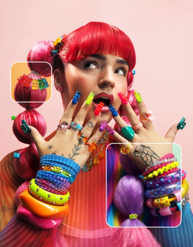
Gummy Gummy More: an omnicolor composition that mobilizes almost all the hues of the color wheel. Primary and secondary colors at maximum saturation, without tertiary mixing. This is the extreme version of the triad — super cool summer color palette!
Dépareillé au même: colors that range from pastel to vivid, across a wide portion of the wheel. The color season palette plays on the variable intensity of a single range.
Récré rétro: primary tones revisited with a vintage touch, faithful to the triadic logic.
The Gummy Gummy More trend from Pinterest 2026 mobilizes the entire chromatic spectrum at maximum saturation — a kaleidoscopic composition that perfectly captures the energy of Gen Z and millennials.
Bold and retro palettes: mixing intensities
Here, the chromatic logic becomes more sophisticated. These trends echo the balance characteristic of an autumn season color palette — dominant warm hues, accompanied by unexpected accents:
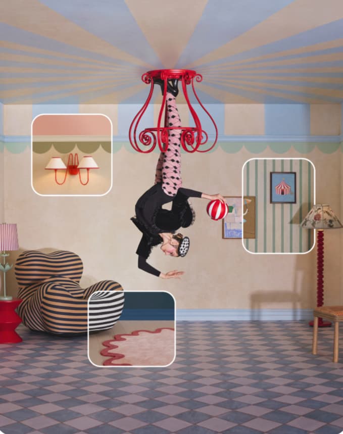
Chapithome: draws from the primary triad (red, blue, yellow) and the secondaries (green, orange, purple), but mixes intensities. Only red is strongly saturated — the other hues remain pastel. A triad with heterogeneous saturation. A beautiful soft summer color palette.
Glamoratti: warm analogous palette, centered on the tertiary yellow-orange-red range. Creates a coherent combination, with a break via a bottle green — the complementary color of bordeaux.
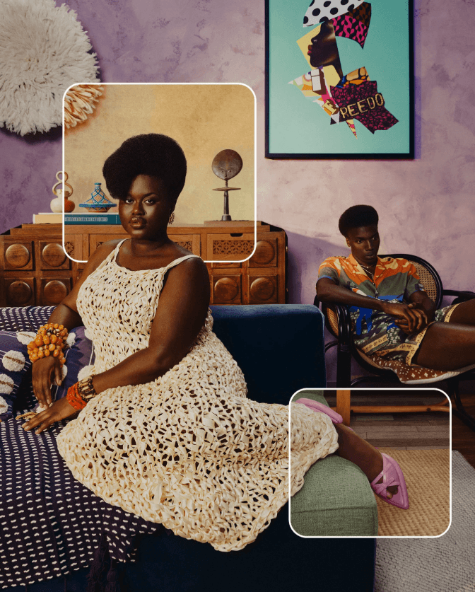
Afrohemian: cool blue-violet dominant, with a deliberate chromatic break via a yellow-ochre, the complementary color of purple.
Mysterious and minimalist color palettes: monochromatic logic
The third family draws on an entirely different strategy — worked in monochrome:
L'âge de glace, Dans la dentelle, En kaki mimi share the same logic: analogous colors very close on the wheel, in a near-monochromatic approach. Little contrast, great depth. Coherence comes from the proximity of the hues, not their opposition.
Dans la dentelle approaches a summer color palette, En kaki mimi an autumn color palette, and L'âge de glace, with its cool blue, a winter color palette.

Pinterest 2026's minimalist trends rely on monochromatic logic — a single family of hues declined in variations of brightness and saturation, with no chromatic break.
These palettes are ideal for brands that prioritize sobriety and visual elegance.
Use color seasons from Pinterest 2026 images in fashion visuals
Understanding the chromatic logic of a trend means being able to reproduce it, adapt it, or translate it into your own visual creations.
From the color wheel to the product shoot
For a fashion brand, each Pinterest trend corresponds to a concrete visual strategy:
Saturated triadic (Gummy More) → bold shoots, colored backgrounds, models in primary summer colors
Warm analogous (Glamoratti) → range consistency across a lookbook or capsule campaign, in the spirit of an autumn season color palette
Monochromatic (L'âge de glace) → clean visuals, neutral background, focus on texture and material — the logic of a winter season color palette
Veeton makes it possible to generate product visuals aligned with any trending color season palette, without resorting to a physical photoshoot.
Adapting your seasonal palette to each distribution format
Social media: triadic and saturated palettes perform better in an Instagram feed — they capture attention in a fast-moving flow
E-commerce: cool summer palette and monochromatic palettes improve product readability and limit visual distraction
Lookbook: the complementary logic (Afrohemian, Glamoratti) creates strong contrasts that work well in print or PDF
Mastering these rules allows you to align art direction, seasonal trends, and content strategy in a single move.
AI clothing try on: Testing color season palettes with an AI outfit maker
Knowing Pinterest color trends is great. Being able to test them visually before launching a collection is even better. That's exactly what AI fashion photoshoot software enables — and in particular, tools equipped with an AI outfit generator.
How does an AI outfit maker work for testing color palettes?
An AI photoshoot software allows you to import garment visuals and have them worn by an AI-generated virtual model, in a few clicks. No model, no studio, no physical production.
In practice, to test a season color palette:
Import the collection pieces (flats or packshot visuals)
Assemble them into an outfit on a virtual model via the AI outfit generator
Generate multiple look variants to compare color combinations
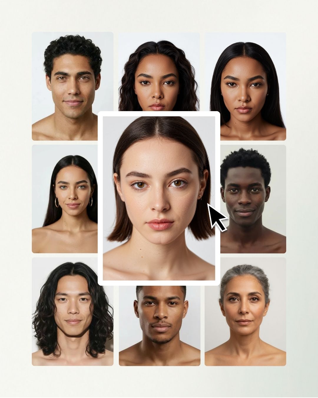
Veeton allows you to import garment visuals and generate in a few clicks outfits worn by an AI model — without any physical shoot.
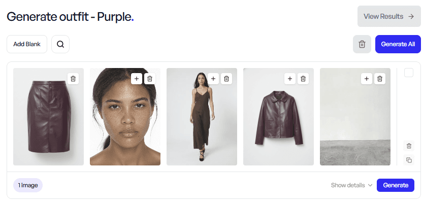
Veeton's interface to generate outfit with AI
Testing all color seasons before going live
The advantage of AI is the speed of iteration. Where a traditional shoot locks in color choices once and for all, an AI outfit maker allows you to test side by side:
A summer season color palette in soft, desaturated tones
An autumn season color palette in warm, earthy tones
A winter season color palette in strong contrasts and sharp accents
An AI outfit generator allows you to visually compare several color seasons on the same virtual model, with no production constraints or additional cost.
For fashion brands following Pinterest trends, this is a decisive time-saver: color decisions can be made based on real visuals, not assumptions.